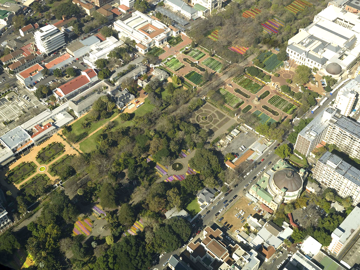
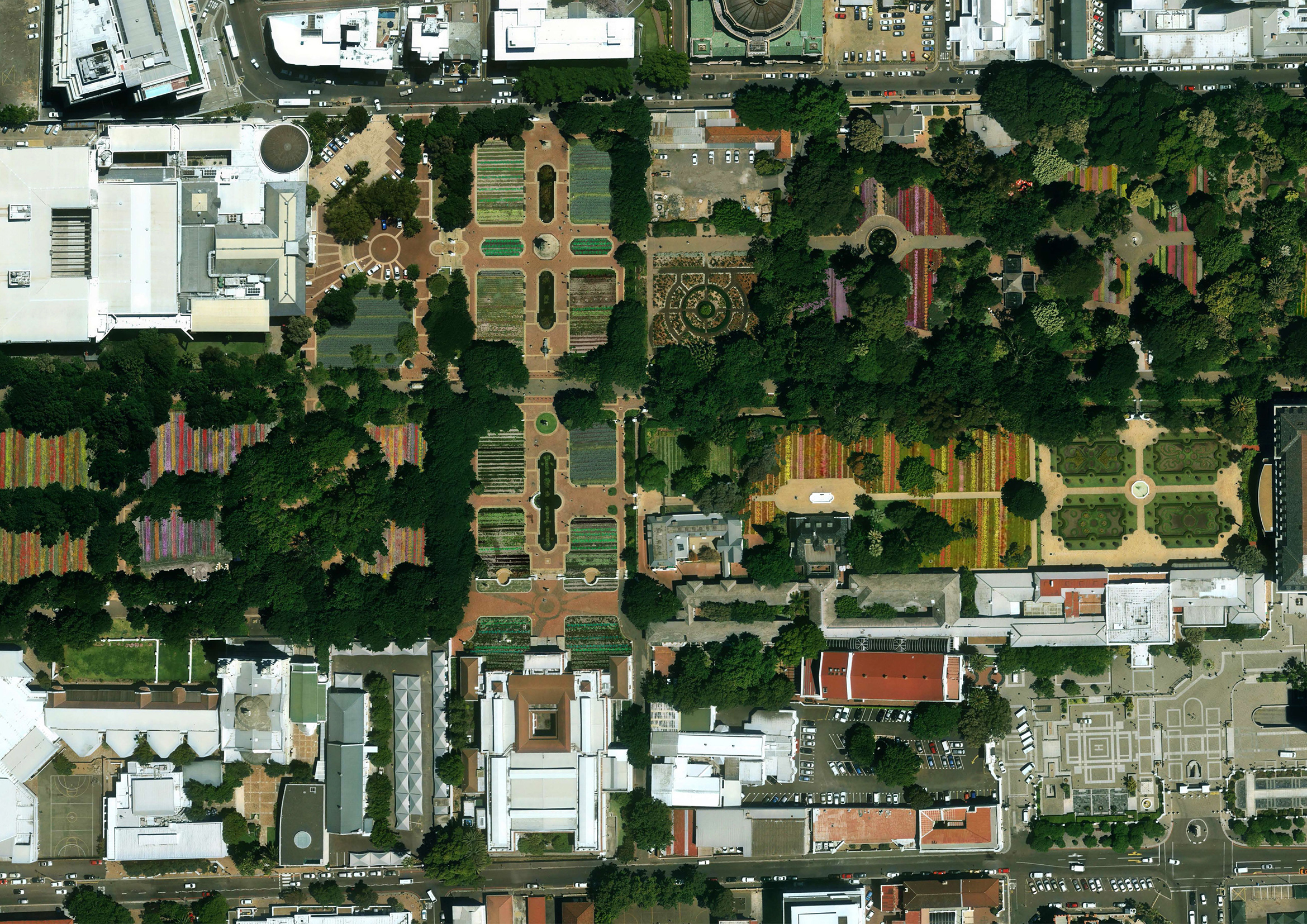
This project is a landscape intervention that promotes urban agriculture in the interest of food security.
Historically, the Company Gardens in the centre of Cape Town were productive food gardens. We proposed that its original function be reinstated temporarily for the World Design Capital 2014.
Although the Company Gardens are historically significant landscapes, the lawn is not original and it is easily replaceable. We therefore proposed that all lawned areas be removed and replaced with vegetable gardens in sunny areas and with commercial flower gardens in the shady areas.
South African cities have far fewer productive gardens than most similar cities throughout the world. This is not sustainable, it threatens food security and it entrenches poverty.
The Gardens in Gardens will be useful, provocative and beautiful. The project would exhibit the efforts of various organisations involved in urban agriculture.
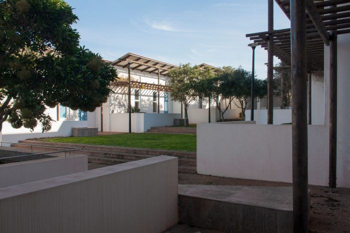
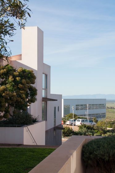
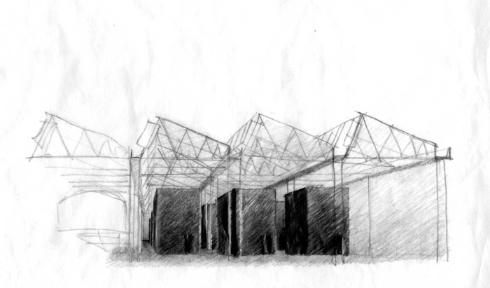
These 10 units provide on-site accommodation for doctors and nurses of the Vredenburg hospital.
To create a domestic and private environment, the staff residence has its main spaces separated from the activities of the hospital. This is achieved by a large stair which creates a threshold to the central space and manipulating the view from the central space to face the valley without any view of the hospital.
The steep mono-pitched roofs are aligned perpendicular to the dominant South-easterly and North-westerly winds to create a space protected from these strong winds.
The stepped platforms necessitated by the topography become useful in creating sub-spaces to the central exterior space. The terraces together with the low walls enclosing the stoeps and the pergolas assign potions of the main space to each unit. These devices are necessary to give the right level of privacy to each unit. Manipulation of the topography is therefore the primary device in establishing the character of the place.
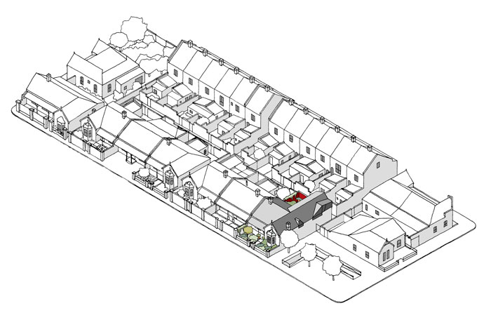
We were approached to design an 80m² house on a site in Parkwood, a residential area on the edge of the Cape Flats. “There is a terrible old building at the back of the site, but we will break it down”, the client explained. Upon visiting the site we realised that the old building is a rare corrugated iron structure that dates from the 1920’s. This building type has largely been obliterated from Cape Town’s suburbs.
We told the clients we would prefer to fix up the old house rather than build new. The clients were emotionally overwhelmed at the suggestion since the building used to be their family home for two generations. Their grandparents were workers on vegetable farms in the area and they had extensive vegetable cultivation at the house. It was abandoned in the 1980’s and they assumed it was beyond repair.
Since 85% of the original Oregon Pine frame were still in good condition we knew that the project was viable. Reusing the old house would give our clients more space than they would have had if we built new, but the budget remained extremely limited. For bloody minded financial purposes and carefully considered conservation reasons we decided to perpetuate the informal way of construction for the new work. For instance there are no flashings used; roof edges are sealed by bending a sheet and windows were built in with cut pieces of flattened corrugated sheet around them. The building was not built with care and this spirit is deemed as central to its character.
A separated double bedroom with en-suite bathroom was added in a way that makes the new read as a later addition. This addition by itself was not sufficient to give the building a contemporary presence. We therefore entered into discussions with the client about the possibility of re-establishing a fruit and vegetable garden.
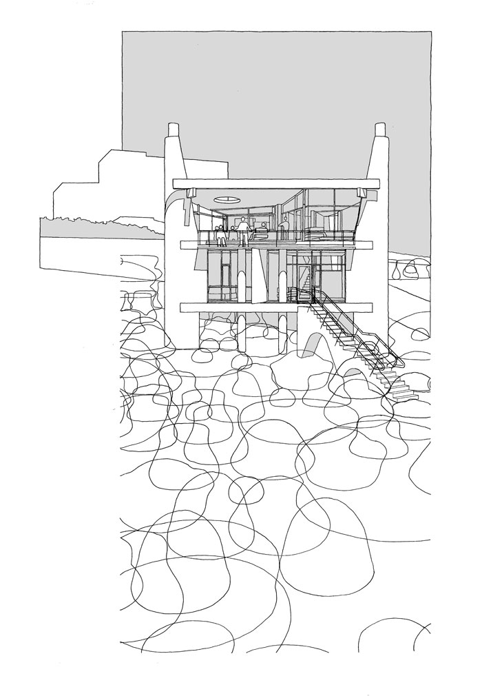
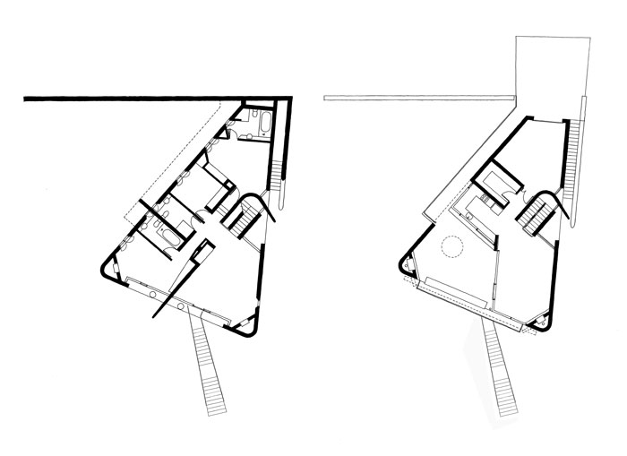
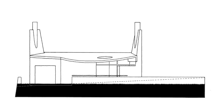
Two giant chimneys and a gently curving concrete roof are the defining features of this beach house.
The character of the house is established as a monolithic form with large scale openings cut out of its apparent mass. Articulated elements such as wall planes, windows and concrete frames set themselves apart from the main mass either by projecting beyond it or by establishing independent figures of form.
The house is entered at its outside terrace which overlooks the estuary and the sea. The kitchen, living and dining rooms are designed to share the view even if it is raining and all doors are closed. The bedrooms are at the more private lower level.
The house is designed to welcome typical holiday activities such as braaing, sitting around a fire place, cooking and eating together, playing TV games and large amounts of people sleeping over.
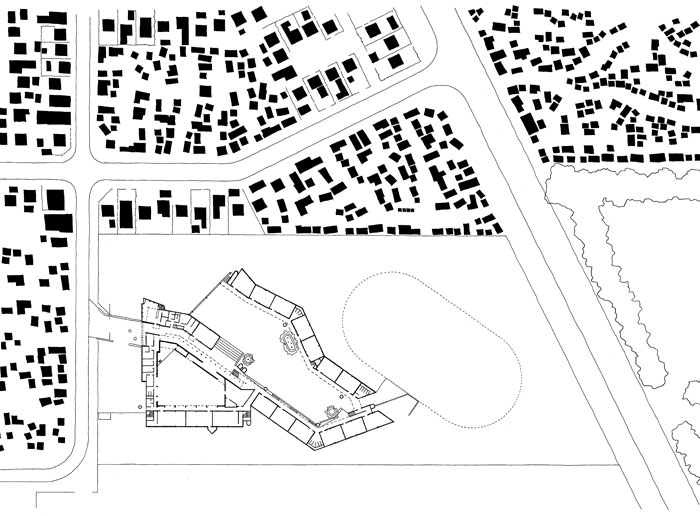
The Inkwenkwezi Secondary School was commissioned by the Western Cape. The school is on the periphery of the settlement next to a very big sport fields and on a dead end street. The Road to the North of the site is such a busy vehicular route that it makes pedestrian access from it undesirable for fear of children’s safety. Access is from the quiet dead end road which allows children to linger safely.
The school protects itself from theft and vandalism by creating an outer “wall” with all play spaces and access points beyond the safety of the entrance gates. The outer “wall” of classrooms encloses an undulating court with an open end facing Table Mountain.
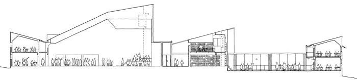
The location of the building on a sloping site, on the edge of the settlement, was exploited to develop a civic architecture that distinguishes itself from the residential fabric around it by its scale and sculptural form. The hall rises to a tall corner which is exaggerated by vertical fluting and has a characteristic window. The same motive is repeated in the library. The entrance façade is layered with the hall and the library/administration block forming syncopated profiles in a composite façade. The entrance to the school is along a ramp, through this façade.
From the township another layering is read: the Junior Classrooms are lowered by a meter to make this block read against the block behind it and the hall at the back. This layered wall architecture with its undulating profiles form a recognisable image for the school. The name of the school (meaning morning star) is painted on this façade.
Since the school brief is largely made up of repetitive classroom modules, the wall architecture is a devise to bind these modules together and set the stage for the large scale undulations in plan which breaks the monotony of the block forms and the corridors.
The windows on the long horizontal facades were bound together by a decorative device that draws inspiration from the way people paint on public buildings, be it lines or signage, which over time re-articulates or de-articulates the architecture. The decorative pattern which also draws on African weave work has its constructional logic in the need for expansion joints between concrete beams and block work and between various panels of block work.
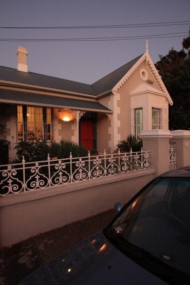
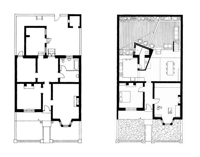
Typical of its time and its urban typology, this Victorian row house has an elaborate front façade with decorative plaster and cast iron work. The front rooms have generous proportions and large windows facing Table Mountain.
The architectural quality of the front was not maintained throughout the house. The back rooms were badly lit and the kitchen in particular was a squat space and it cast a shadow over the courtyard.
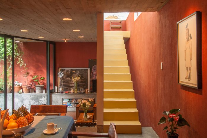
In redeveloping the house, the roof behind the front gable was extended to the back of the property to gain additional space and the interior was adjusted to a contemporary way of life. At a functional level this meant the integration of living spaces into one large space and a direct connection to a courtyard where outside living and dining can occur.
In the architecture, a dialectic between interconnected spaces and the room-based architecture of the original building is set up. As much as the cellular character of the back rooms was undone through demolition, a new 10m x 10m room was created that incorporated both inside and outside space.
The symmetrical access into the large back room is deflected towards the dining and living rooms by the angled wall of the bathroom. This deflection is amplified by semi-circular circulation through this 10 x 10 room. The circulation pattern is amplified by connections made between the various functions within the 10 x 10 space; the original Oregon Pine floor connects the kitchen, entry and dining room, the off-shutter concrete soffit connects the dining and living rooms and the new wooden floor connects living room and the outside courtyard. The result is an interconnected free flowing space within the confines of a larger room.
The physical characteristics described above are brought to life through light. Two roof forms, extruded perpendicular to the main roof, bring light into the depth of the plan. Most of the light sources in the 10 x 10 room are concealed with light made visible though the way it falls on walls. The apparent size of the space is exaggerated by concentrating the light on the periphery of the plan.
Strong form making and manipulation of space could lead to a manicured, formal space that antagonises the accommodation of daily life within the house. Therefore the purity of the form is antagonised by creating ledges that can accommodate shelves, electronic equipment, plants and storage.
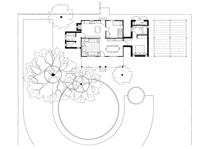
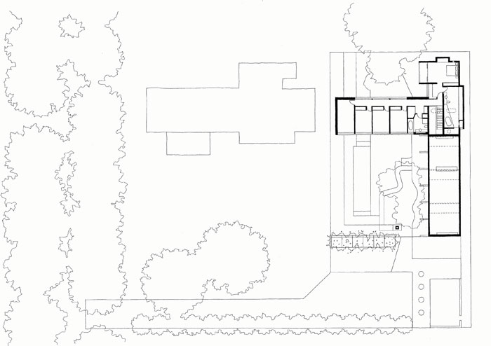
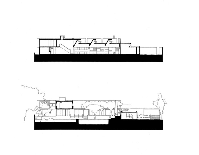
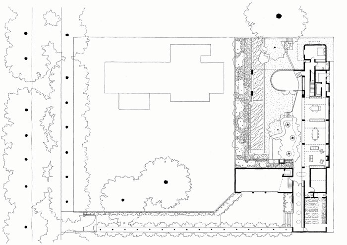
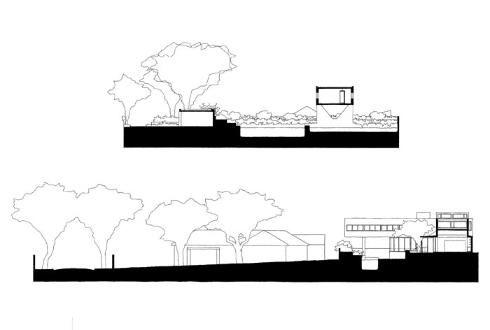
The site for this house is on a pan-handle off a beautiful Jacarada lined street in Melrose, Johannesburg. Just like the street makes a spatial structure of natural elements so the garden of this house is the main space of the architecture. Everything else is secondary. With the garden in its infancy the architecture is more dominant than it would be once the garden has matured.
On this relatively featureless site, a dramatic landscape section was invented that is the focus of the internal spaces. The garden architecture makes a base for the sculptural forms of the house. In time, the building will be a secondary layer behind the primary structure of trees and shrubs. Canopies are cut away to make room for trees.
The clients were advised that their brief implied a house that was almost too big for the site. To maximize the garden space the children’s bedroom wing was built in the air, bridging over the pool and fishpond. Just like the garden borrows space underneath the children’s wing, the view from the children’s bedrooms is over the garage to the trees of the suburb. The terraces diminish the spatial impact of the boundary walls and with the pool and fishpond they exaggerate the elongated character of the garden.
The trees next to the living/dining/kitchen area will allow light to filter trough their leaves and branches into the living spaces in the morning. To avoid these trees blocking the north sun, three high level windows were created with light scoops that cut into the rectangular volume of the living space and give definition to each of the sub-spaces. The formal strength of these light scoops (as revealed in section) is concealed to the outside to maintain a domestic quality and to ensure the secondary nature of the building relative to the garden.
The ceilings were developed as the dominant architectural element of the house. The house is for a large family, who should be free to live in the house as they want; floors are either filled with furniture or covered with planting in the garden, walls should not to be precious and can be covered with shelves, paintings, curtains, drawing, etc. The only surface that remains to give definition and character to the space is the ceiling. The most important aspect of the children’s wing is its ceiling that extends from inside the house far out into the garden. This devise brings together the two main structural aspects of the architecture – the ceiling and the garden.
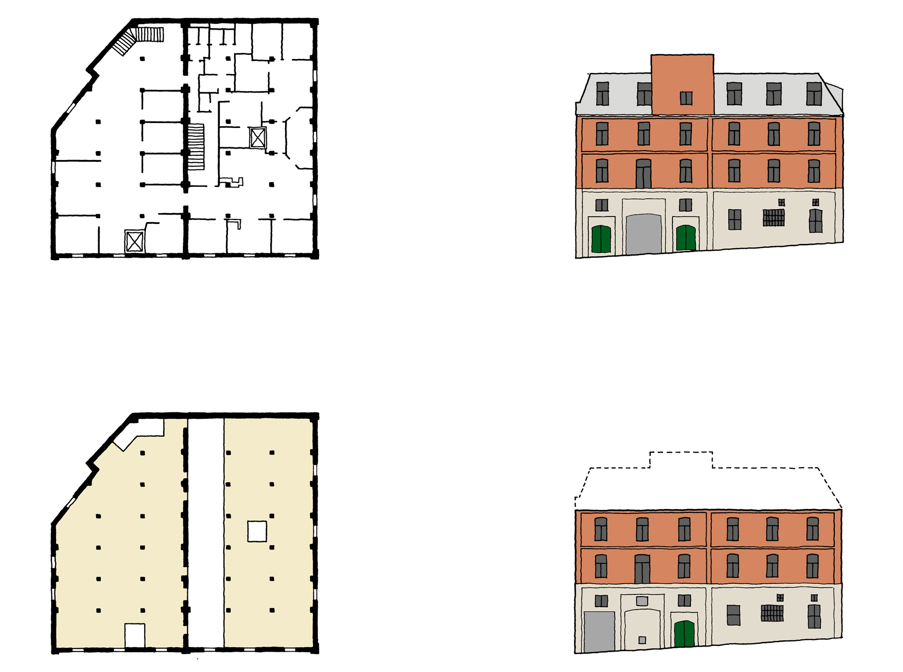
The warehouse on 24 Alfred Street was designed by Ernest Seeliger in 1901 and consisted of an exterior load bearing brick façade, an internal brick firewall and a five storey load bearing timber structure. Over time, a series of divisions turned the interior into a warren of small spaces with ad hoc services. Neither the structure, nor the fire escapes complied with contemporary fire regulations.
Demolitions
The mansard roof was removed, the interior cleaned up and the dysfunctional elevators and stairs were removed.
New Structure
A new concrete framed service core was introduced containing the new elevator, fire escapes, ablutions and vertical ducting. The steel frame was supported on the perimeter walls and on the timber structure below.
Cladding
Fire and weather protection necessitated cladding of the structure. The exterior zinc sheeting was articulated as a taught skin by having the inclined windows flush with the metal sheeting and with minimal window frames that made the windows read as simple punctures into an uninterrupted seam pattern. All vertical windows protruded from the sheeting to read as bay windows. On the interior, gypsum board cladding was used to cover vermiculite fire protection to the steel. The gypsum board was only used where necessary; the lightweight concrete beam and block floor system remained exposed.
The new addition was treated as a giant hat onto the old brick structure. In this way the importance of the brick base is maintained and a harmonious relationship is set up between the old structure and the new with neither the historic nor the modern in a dominating position. The window pattern of the existing building was perpetuated in the new addition. Disruptions in the window pattern occur at the top of the building and where there was no regular window pattern in the lower brick section.
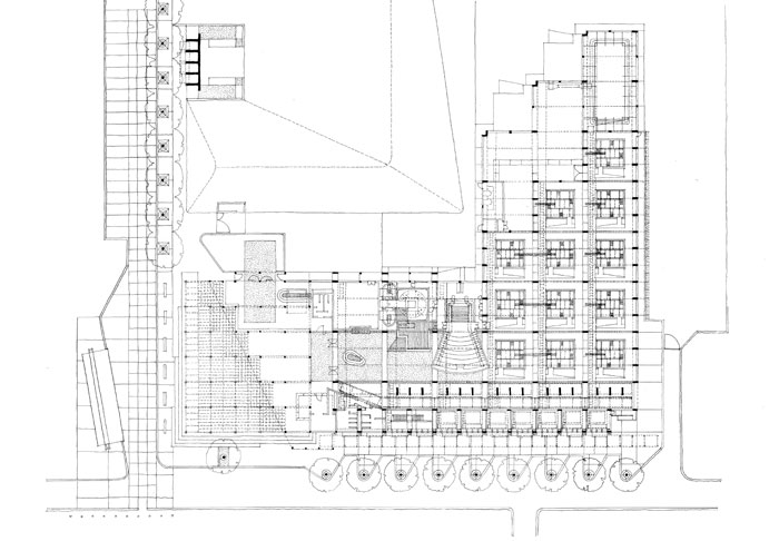
It is designed to challenge conventional views of museum design. It draws on the work of Andreas Huyssen who has written extensively on the concept of memory and history. Visitors are not treated as consumers but active participants. The conventions of representing history as a single story are challenged through the design of the museum spaces. The past is represented as a set of memories that are disconnected yet bound together by themes.The concept of the Memory Box is used to achieve these ends. These boxes are inspired by the boxes that migrant workers used to accommodate their prized possessions when separated from their rural families. These memory boxes were highly treasured. The Museum comprises a series of 12 unmarked, rusted boxes offering a set of different memories of struggle in South Africa. The boxes are housed in the main exhibition space and each box is 6 meter by 6 meter and 12 meters tall. The contents of the boxes are revealed only on entry – there is no sequence – the contents and themes of the boxes are juxtaposed – the experience in each box is a total one. The spaces between the boxes are spaces of reflection – what Huyssen calls the twilight of memory. The Museum also comprises an auditorium, library, art gallery, offices, a memorial space to commemorate the local heroes of the struggle and an adjoining tomb where Raymond Mhlaba and Goven Mbeki, national struggle heroes, are buried.
Red Location
Red Location was the first settled Black Township of Port Elizabeth. It derives its name from a series of corrugated iron barrack buildings, which are rusted a deep red colour which were part of a Boer Concentration Camp in Uitenhage and moved in 1900 to Red Location where the first settled urban Black families settled. It became a site of struggle during the years of Apartheid. Many prominent political and cultural leaders were either born or lived in Red Location.
Conclusion
Red Location offers the opportunity to draw together the strands of struggle that mark the attempts by different groups in South Africa to free themselves. It is ironic that the activists of Red Location should occupy the same sets of spaces that their so-called enemy, the Boers, occupied as spaces of incarceration for their women and children in the concentration camps of the Boer War. South Africa is a country with a tumultuous history marked by the striving of various groups to be free. The lesson of the Museum is that freedom should never come at the expense of any other group of people.